The Artist
Rose Nolan produces work in a range of material forms: banners, wall paintings, posters, photographs, books, small sculptures, multiples and large-scale installations. Her work is characterised by its reduced palette of red and white; its raw and relatively inexpensive materials, such as cardboard and hessian; and its palpable sense of personal labour through its handmade, rather than mass-produced or highly polished, finish. Aesthetic forms associated with Russian constructivism and its coupling of a pragmatic, utilitarian approach to art, architecture and design with utopian, even revolutionary, social ideals continue to inform Nolan’s work, as does conceptual art and its use of language as a material form.Working with large-scale wall paintings (where a single word or phrase is writ large), as well as banners, which have a strong association with public proclamation (being carried aloft in marches and protests, hung on buildings or displayed at mass gatherings), it is Nolan’s twist on the declamatory aspect of language’s visual presence in art that is most apparent in her work. In particular, her use of language brings a personal, self-questioning, even doubting element into her work that brushes up against the emphatic form of address associated with banners and undercuts any heroic associations lingering in her references to the monumental forms and visionary attitudes of early 20th-century avant-garde practices.
The work was initiated by the City of Melbourne in early 2019 on a very short turnaround of 4 months for final detailed design. The work is permanent and produced during Melbourne’s extensive lockdown. City of Melbourne approached the conceptualisation of the brief initially from a practical stand point given the short timeframe and the necessary requirement to work with the already planned screening. If there had been a more radical proposal made commissioners say they would have tried to seek additional funding, but practically speaking the timeline and creating this art work under a Covid situation was unlikely to make that a viable option if they were to stay on track with construction timelines. Process and artist selection was shaped by these practical considerations, with only 4 months to conceptualise an artwork and take it through detailed design with the architects. The Queen Victoria Market (QVM) renewal development team approached the City of Melbourne quite late in the construction process with the façade opportunity and in response project lead Jo Mair and architects approached three artists who could respond creatively to the material requirements of the façade. Primarily aspects an artist could easily influence were the flat surface of the screens through an applied design (paint, etc) and the perforations (shape and distribution of perforations) but maintaining the required % of shading needed to meeting planning conditions. The three artists were invited to meet with the QVM renewal team (the architects and Mair) to discuss the opportunity. They were asked to simply respond to two questions 1: What do you find compelling about the opportunity and 2: Proposed approach and methodology. It was very evident from those three meetings (conducted over three separate days) that Rose Nolan had a clear and compelling connection to both the market and the opportunity and that her process and methodology were well aligned to achieve an exceptional outcome working closely with the architects, who were thrilled to be working with her. Nolan brought significant respect/ power, personality and collegiality to a compact time frame that could easily have become more complex if the wider team wasn’t aligned in thought and direction.The cost of Nolan’s façade artwork was largely cost-neutral as there was already an expectation of a perforated screen element for the building. A change to two colours required for Nolan’s artwork was an approx. AUD$30,000 increase in budget, and Nolan was paid a design-only fee of AUD$30,000.
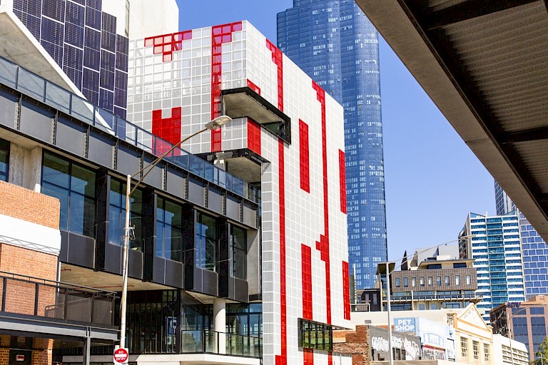
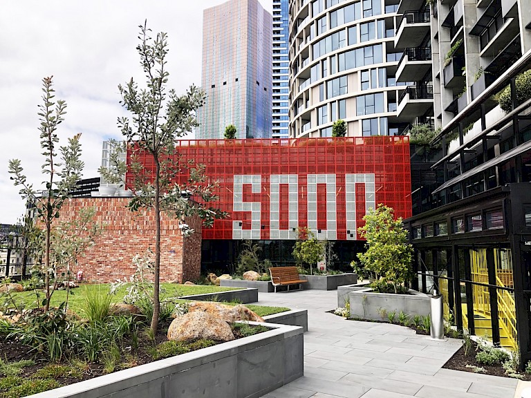
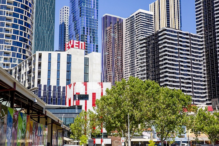
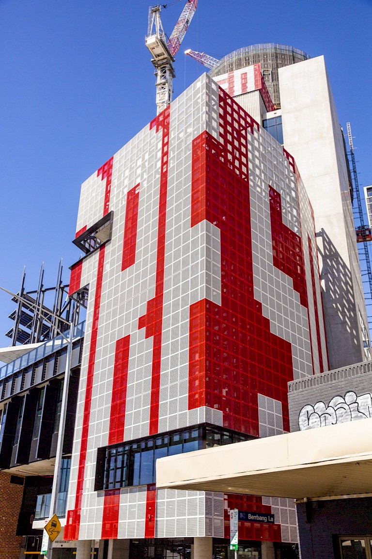
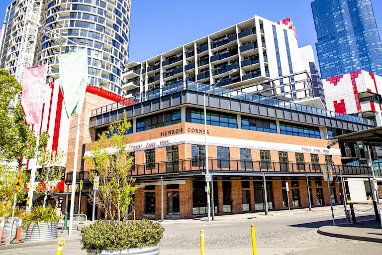
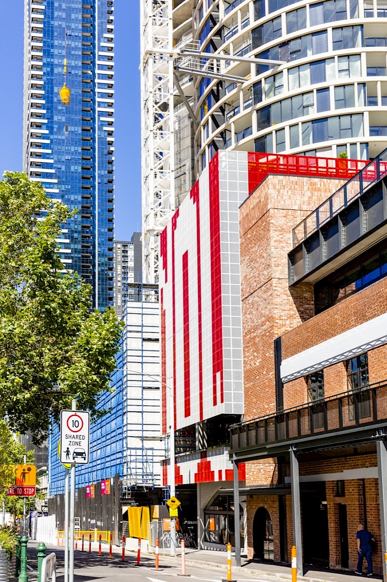
Rose Nolan has long played with extremes of scale in her art practice, often employing wry texts in her large-scale and text-based public art works. Consistent with her practice, for Screen Works (ENOUGH-NOW/EVEN/MORE-SO) Nolan employed a rad¬i¬cal¬ly reduced palette of red and white, using and sim¬ple util¬i¬tar¬i¬an mate¬ri¬als and meth¬ods in an explo¬ration of per¬son¬al, play¬ful and often self-effac-ing nar¬ra¬tives. Fully integrated into the structure of the building, Nolan’s bold responsive artwork both crowns and forms a dynamic facade of the new 10-storey building’s design, one of many links the art work creates to site and community. The Queen Victoria Market (QVM) is an inherently layered site with a complex history currently in transition. Referencing the market’s role in social and economic exchange, Nolan’s work is a key aspect of the QVM Precinct Renewal plan, a major body of work seeking restore the market’s heritage while delivering modern facilities and revitalising a growing part of the city. Nolan comments that “Screen Works… aims to contribute an optimistic, complex and bold design to the screen facades of the Munro Community Hub. As a series of connected words, they conjure up a sense of perseverance; of change; of forward thinking and improvement to transition from one state to another.” Highly site specific and respon¬sive to the unique context of the QVM area, in Nolan’s art work it is clear that seriality and rep¬e¬ti¬tion can be effective tools in large scale outdoor art works, and the impor¬tance of lan¬guage, inter¬ac¬tiv¬i¬ty, and the expe¬ri¬ence of the viewer in place-making public art. Nolan describes the work as a ‘verbal-visual puzzle’ and her text-based propositions – which can be seen from a great distance – act to prompt viewers into engaging with their interpretation. Nolan’s choice of words aren’t obvious but thought provoking and somewhat questioning of development and change in the city and the market precinct which is surrounded by dense redevelopment. In a world where much culture has become simplified and easily delivered to the consumer, Nolan instead teases meaning and wraps her audience into the art work, allowing intention to be approached from awry and collectively. Exploring materials, typography, patterning, and abstract form, Nolan creates an intriguing and surprising anchor-point to the Munro Site Western Hub, a conceptual and modernist work as a counterpoint to the historic area. Scale is a crucial means by which she negotiates and frames the public nature of the site. Screen Works… is architectural in scope, a match for the 10 story building that thoughtfully exploits the inherent graphic nature of text. Nolan uses text as material object – ‘found’ text that is derived from the everyday where words are chosen for their visual presence, formal qualities and linguistic content.